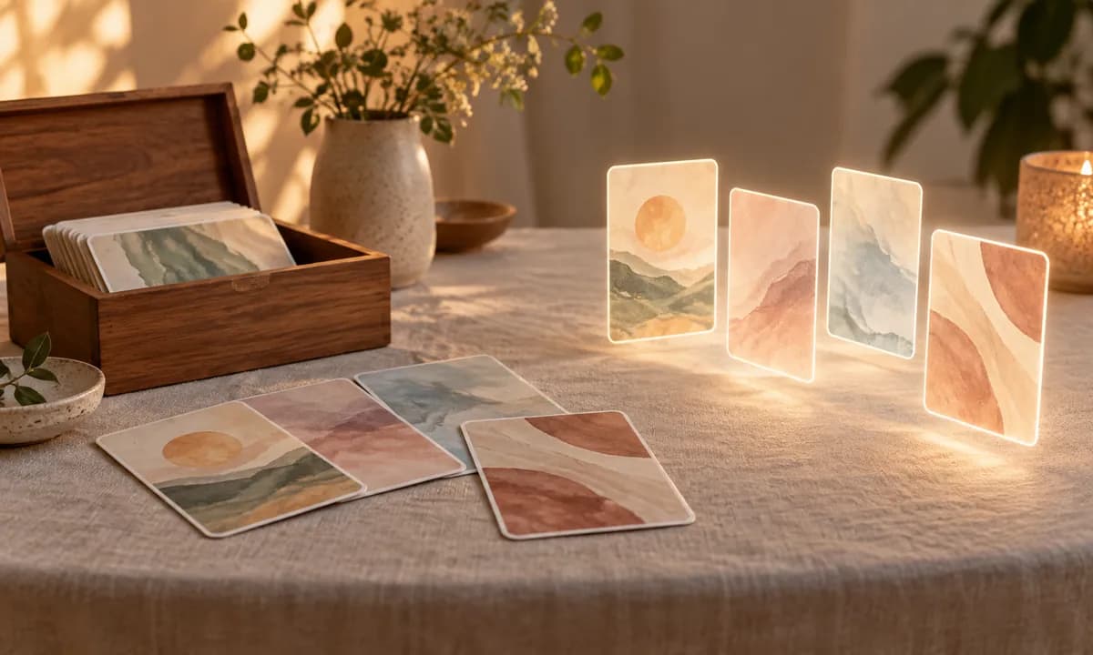
Anyone who has worked with several decks knows the feeling: some images open a conversation instantly, and others sit there doing nothing. The difference isn't artistic quality — plenty of beautiful pictures make poor metaphorical cards. It's about a specific set of qualities that let an image hold someone else's meaning.
Here's what actually makes a card work, whether you're choosing a deck or curious about how they're designed.
The Core Requirement: Room for the Viewer
A metaphorical card has one job: to invite projection. Everything else follows from that. The image needs enough content to catch your attention and enough openness that your own associations can settle into it. Too empty and there's nothing to respond to; too specific and there's no room for you.
This is why the most literal images make the weakest cards. A stock photo of a smiling family at a picnic tells you exactly what it is and what you're supposed to feel. There's nothing left to project onto. An image of a figure at a window, half-lit, direction unclear — that one has space in it.
1. Ambiguity Without Emptiness
The balance is delicate. Good cards suggest a situation, a mood, or a relationship without resolving it. Who is that person? Are they arriving or leaving? Is the light coming or going? Those unanswered questions are exactly what a viewer fills with themselves.
The test: could three different people look at this and see three genuinely different things? If the answer is no, it's an illustration, not a metaphorical card.
2. Emotional Openness
An image works best when its emotional register can be read more than one way. A dark forest path might be threatening or sheltering depending on who's looking. That flexibility is a feature — it lets the card meet whoever picks it up, on whatever day.
Cards that dictate emotion — obviously cheerful, obviously tragic — narrow what a person can bring, and tend to produce polite agreement rather than genuine reflection.
3. Originality and Coherence Across a Deck
Where images come from matters. Stock photography tends to be literal by design — it was made to communicate a clear idea for advertising, which is the opposite of what's needed here. Images created deliberately for reflection can be built with that openness in mind.
Coherence matters too. A deck where every card shares a visual language feels like a single instrument. A deck assembled from scattered sources feels like a search-engine result, and the inconsistency itself becomes distracting — people start reacting to the mismatch rather than the image.
4. No Fixed Meanings — and This One Is Non-Negotiable
A metaphorical card must not carry an assigned meaning. No key, no booklet of interpretations, no symbolic system to learn. The moment a card means something official, the viewer stops consulting themselves and starts consulting the meaning.
This is the clearest line between metaphorical cards and tarot. Tarot is a rich, structured system where cards have established meanings a reader interprets — that's the point of it. Metaphorical cards work in reverse: they're deliberately empty, so that everything in a reading comes from the person looking. Nothing is predicted, nothing decoded.
5. Suitable for the Setting
For professional use, a few practical qualities matter:
- Not gratuitously distressing. Cards should be able to hold difficult feelings without imposing them. Graphic or shocking imagery can overwhelm rather than open.
- Broadly accessible. Images that assume one culture's references limit who can use them.
- Wordless, usually. Text tells people what to think, and it doesn't travel across languages.
- Emotionally varied across the deck. A set that's all serene, or all bleak, can't meet a person wherever they actually are.
6. Legible at a Glance
An overly busy image is hard to respond to. The eye needs somewhere to land. The best cards have a clear focal point with detail around it that rewards a longer look — you get an immediate impression, and then more if you stay.
This matters practically too: cards are often viewed small, on a screen or across a table. If an image only works at full size, it will work less often than it should.
A Quick Checklist
- Could three people see three different things in it?
- Is the emotional tone open rather than dictated?
- Is it made for reflection, not repurposed from stock or advertising?
- Does the deck share a coherent visual language?
- Are there genuinely no assigned meanings?
- Is the emotional range across the deck wide enough?
- Does it read clearly at a small size?
See for Yourself
The fastest way to develop a feel for this is to work with images and notice which ones open something. The MindTrays decks are original artwork made specifically for reflection, with a consistent visual language across each set — Essence for layered emotional work, Figures for relational imagery, Textures & Abstractions for feeling without form.
Try a single image first: pull a free daily card and notice whether it leaves you room.
Explore all decks on MindTrays
— MindTrays Team
Try it in your browser
Open a deck, lay out a single card, and start a quiet reflection — on your own or with someone, in real time.